Many small-business owners invest in stylish websites, only to find that visitors leave without taking action.
You might be surprised to learn that 70% of small-business websites struggle to convert visitors into actual customers. If your site looks great but doesn’t guide users toward a decision, it’s quietly costing you new leads.
This guide will walk you through each step of building a high-converting site—from choosing the right host to writing CTAs that drive action—so you start turning traffic into results. If your goal is to master high-converting website design small business strategies, this guide is for you.
Let’s start by looking at why focusing on conversions matters more than ever for small businesses.
1: Why Conversion-Focused Design Matters
1: The ROI of a High-Converting Website
Even a minor boost in conversion rate can make a noticeable difference in income. Say your website pulls in ₹50,000 a month—just a 1% bump could bring in another ₹10,000. That’s the reason small business website design best practices aren’t only about how things look—they’re about what lands in your bank account.
2: Common Small-Business Website Pitfalls
It’s surprisingly easy for small-business websites to get things wrong—messy designs, menus that make no sense, and no strong CTA anywhere. These flaws quietly chase people away. If you’re after leads, keep things clean and fast. Below are a few UX design tips for small business websites to keep in mind:
• Navigation should be clear and not move around
• Button text needs to say what action to take
• Don’t use fancy animations that slow the site down
3: Google & User Signals for Conversions
Google watches how well your site runs—Core Web Vitals like CLS (Cumulative Layout Shift) and LCP (Largest Contentful Paint) feed into your rankings. When you boost those, your site not only climbs higher on Google, but people also find it easier to use. Read up on Google Core Web Vitals. Before a website can convert, it needs to connect. And connection starts with understanding your target audience—especially in the SMB space. So, a mobile-friendly website SMB matters too—it makes sure pages load fast and bounce rates stay low on phones.
2: Core Conversion Principles & UX Fundamentals
1. Know Who You’re Talking To—Really
Here’s the thing: you can’t build a site that converts if you don’t know who you’re trying to convert. Sounds obvious, but you’d be surprised how many skip this. So start by building personas—not just vague guesses, but actual profiles based on real people. Think about what keeps them up at night.
Are they struggling to grow their business? Confused by too many digital tools? Make a list of the questions they’re asking and the problems they’re trying to solve.
When you dial into that, everything else—your content, your layout, even the words on your buttons—becomes way more intentional. Small business websites that do this feel personal, not generic.
2. Get to the Point (Fast)
First impressions are brutal. If someone lands on your homepage and has to guess what you do, you’ve lost them. That’s why your value proposition needs to hit them above the fold—no scrolling, no guessing. Just clarity.
Say something like:
“Get More Clients with a Fast, Modern Website. Schedule Your Free Consultation.”
No fluff. Just value.
People are busy, especially small business owners. Your site should tell them why they should care—right away. That’s what makes a high-converting website design work: clarity and relevance from the first second.
3. Make It Easy to Read—Not Fancy
People don’t read websites like novels. They skim. So structure your content accordingly:
- Use headlines that actually say something
- Break up big blocks of text (please)
- Leave room to breathe—white space is your friend
Avoid walls of words and tiny fonts. Think of your layout like a street sign: someone should understand where to go at a glance. Check out a few landing page design small business examples and notice how the best ones guide your eyes without making you think too hard.
4. Don’t Make Them Wait
Speed kills—or saves—your conversion rate. If your site takes too long to load, people bounce. No joke.
Here’s what to do:
- Shrink your image sizes
- Use caching
- Pick a theme that’s not bloated with stuff you don’t need
Then test it. Google PageSpeed Insights is free and easy. If your site isn’t built for mobile-first, you’re automatically behind. Everyone’s browsing from their phone, especially in service-based or local SMB spaces.
The bottom line: fast, clean, and clear beats pretty-but-slow every time.
3: Step-by-Step Technical Setup (Without the Headaches)
1. Hosting & CMS: Don’t Cheap Out Here
If there’s one part of your site you really shouldn’t cut corners on, it’s hosting. You want something fast, stable, and secure—without needing to know what half those server acronyms mean.
SiteGround’s GrowBig plan is a solid choice. It’s optimized for WordPress, doesn’t go down every five minutes, and comes with support that actually responds.
Pair that with WordPress as your CMS, and you’re in business. WordPress might not be shiny and new, but it’s reliable, flexible, and packed with plugins that grow with you. That’s why it’s often the go-to for small business sites that want room to scale without reinventing the wheel.
2.Theme Matters More Than You Think
Here’s where a lot of people mess up: they install a theme that looks cool but slows their site to a crawl. Bad move. You want something lean and built for conversion.
Two great picks:
- Astra Pro
- GeneratePress
Both are lightweight, fast, and coded in a way that doesn’t bog down your load times. They also make it easier to build sections that guide users to act (you know—clicking that button, filling that form, etc.). These are WordPress theme conversion optimized, so you’re not wrestling with bloated code or clunky builders.
3.Plugins You’ll Actually Use
You don’t need 30 plugins. Just a few that do their job well:
- WP Rocket (or W3 Total Cache) – Speeds things up, plain and simple.
- Rank Math (or Yoast) – Handles on-page SEO so your content doesn’t disappear into the void.
- WPForms (or Ninja Forms) – Gives people an easy way to reach out. No coding needed.
These aren’t just “nice to have.” They directly affect performance, rankings, and leads.
WP Rocket can shave precious seconds off your load time, which matters more than most realize—because yes, people will leave if it takes too long.
Rank Math and Yoast help keep your SEO on track without needing an SEO degree.
And those form plugins? They make sure your visitors can actually contact you when they’re ready to take action.
4: SSL, CDN & Security Basics
Install an SSL certificate and configure Cloudflare for CDN and DDoS protection. Secure sites gain trust and better rankings. Use this Moz HTTPS Guide to implement a secure small business website SSL setup.
4: Crafting Conversion-Focused Content & Messaging
1. Writing a Headline & Subheadline That Actually Converts
Here’s a truth people miss: if someone lands on your homepage and doesn’t immediately get what you do and why it matters to them, you’ve already lost them. Your headline’s job is to stop the scroll, full stop. Not just “look nice.”
So how do you do that? You keep it simple, emotion-first, and direct. Think:
- “Struggling to Get Leads? We Build Sites That Convert.”
- “Boost Your Online Sales with Conversion-First Design.”
These work because they get to the point, and they speak to real problems. That’s where good headlines live—in clarity, not cleverness. Supporting it with a quick subheadline helps fill the gaps, but the headline for small business site strategy? It starts by answering: “What’s in it for me?”
And don’t trust your gut—test everything. Use A/B tools. What feels right in your head may not win when it’s live.
2.Don’t Just Talk About Features (Nobody Cares)
Look, nobody’s buying your product or booking your service because you offer a “Responsive Layout” or “Flexible Architecture.” Those are features. People want results.
Instead of:
“Responsive Layout”
Say:
“Your site looks amazing on every device, no matter what they’re using.”
It’s a shift in voice, but it’s huge. You’re putting them in the picture. That’s the heart of benefits-first copy small business messaging—you don’t just show off what you built, you explain what it does for them. That’s what converts.
3. Add Real-World Proof (People Trust People, Not You)
You can say whatever you want on your site—but what really sways people is what others say about you. This is where social proof kicks in.
Add:
- A handful (3–5 max) of actual, believable client testimonials
- Trust logos, maybe a few review badges, even screenshots
- Pull in Google reviews—bonus points if they mention results
Oh, and if you’ve got a resource like your Marketing Automation Guide, drop a link when you mention email stuff. That subtle nod shows you know your stuff without screaming “look at me.”
This is how you build social proof for small business website visitors—no shouting, just showing.
4. Make Your CTA Obvious and Unavoidable
A CTA isn’t just a button—it’s the bridge. So don’t tuck it away or treat it like an afterthought. Use clear, strong language that tells them exactly what they’re getting. Like:
“Book My Free Audit Now”
It’s action-oriented. No fluff. It works because it’s specific, and it doesn’t make them think. And be consistent—same color, same tone, repeat it a few times throughout the page.
This is where effective CTA button design small business pages make or break the flow. If your CTA blends in, you’re done. If it stands out—and speaks directly? You’ve got a shot.
5: Conversion-Boosting Page Templates & Layouts
1: Homepage Template Blueprint
Make sure you include a headline, a trust section, a quick services snapshot, a testimonial, and a clear call to action. This homepage template small business conversion structure keeps visitors interested and engaged.
2: Service or Product Page Layout
Use a clear H1, a summary paragraph, feature bullets, a case study, and a call to action. This is a proven service page design small business method.
3: Landing Page Structure for Lead Generation
Take out the top navigation, use a compelling offer headline, keep the form short, and minimize distractions. Check out landing page design small business examples for reference.
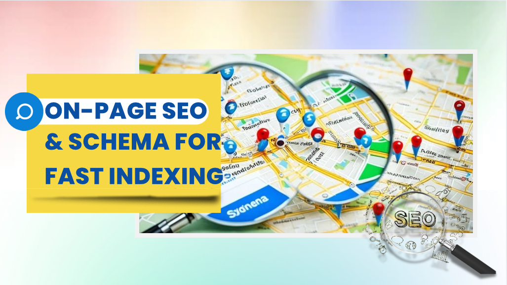
6: On-Page SEO & Schema for Fast Indexing
1: Crafting a Keyword-Rich URL & Meta Tags
Use a short, keyword-heavy slug like /high-converting-website-design-small-business. Not just for SEO — it helps people figure out what the page’s about instantly. Titles should be direct and helpful. Something like “High-Converting Website Design for Small Business | 2025 Guide” works. Your main keyword? Stick it near the beginning. Also, keep the meta description under 155 characters. This stuff improves CTR and gets your small business pages indexed faster, which is kind of the point, right?
2: Header Structure & Keyword Placement
Stick to the standard layout—H1 for the big idea, H2s for sections, H3s for smaller bits. Sprinkle in your target phrases naturally. Stuff like small business website design best practices. Don’t overdo it though. Somewhere in there, drop a link to your SEO Strategies for Small Business websites—it helps both readers and rankings.
3: Image Alt Text & Compression Best Practices
Every image needs alt text. Not only is it better for SEO, it also improves accessibility. Use something real and relevant like “high converting website example for small business.” Don’t skip this step. Compress your images so they stay under 150KB—page speed matters. Tools like TinyPNG and ShortPixel do the job well without killing quality. You want your site to load fast and still look good? This is how.
4: Adding FAQ Schema for Rich Snippets
Add questions people actually ask: How much does a high-converting site cost? How long until results show up? Can I use WordPress? Then use JSON-LD to wrap it all in FAQ schema for small business website indexing. If done right, Google might pull these into rich snippets, which is gold for visibility. Keep the questions simple and make sure the answers are useful, not fluffy. Just real info, fast.
7: Testing, Measuring & Iterating for Growth
1: Installing Heatmaps & Session Recordings
Install Hotjar (honestly, the setup isn’t too hard) to start watching how people interact with your site. You’ll catch weird drop-offs or sections no one’s paying attention to—stuff that’s easy to miss otherwise. This kind of behavior tracking is a no-brainer if you care about heatmaps for small business site optimization. It’s super helpful, even if you just check it now and then.
2: A/B Testing Headlines & CTAs
Use Google Optimize—or any split-test tool you like—to run simple experiments. For instance, try “Get My Free Audit” vs. “Start Converting” and see which one actually works better. Run just a couple of tests monthly—you don’t need to overcomplicate it. That’s what makes effective A/B testing small business website strategies so doable. Most folks skip this and lose easy wins.
3: Tracking Conversions in Google Analytics
GA4 is your go-to here. In Admin, go to Events, then create a conversion event. Track things like form submissions—it’s way more valuable than random stats. If you’re not using GA4 conversion tracking small business insights, you’re missing out on what’s actually driving leads.
4: Quarterly Audit & Content Refresh
Do a cleanup every three months or so. Add a few new client quotes, maybe list updated services, and swap old meta data like “2025” to “2026.” Even small changes count. Treat this like your website audit checklist small business habit—it helps keep everything relevant and sharp without needing a full redesign.
Conclusion
Alright, let’s quickly wrap this up. The top part of your site? That’s prime real estate. Use it wisely—make it obvious what your business offers and why someone should care. From there, don’t cheap out on hosting; speed and security are non-negotiable. Pick a theme that’s actually built for conversions, not just looks. And seriously, lean into the trust stuff—testimonials, benefits over features, and language that sounds like an actual person wrote it.
Also, don’t just set your site and forget it. Keep testing things. Tweak headlines, buttons, whatever isn’t working. Run a simple audit every few months—it doesn’t have to be complicated.
If you’re more the type who’d rather hand this off, you can always schedule a free 15-minute audit. No strings. Just helpful feedback on what’s working and what’s not.
And hey—if you’ve got thoughts, questions, or even small rants, drop a comment below. We read them all. If this helped, send it to another small business owner who’s tired of having a website that just sits there doing nothing.


